Venue - Header - Set up mega menus on your store
Venue
This article is for merchants using Venue version 10.0 onwards who wish to incorporate content rich mega menu style dropdowns into their store. This version of Venue allows you to create both mega menus with promo images, and mega menus with collection images.
By default the theme creates 'simple' menu dropdowns on nested links. In this article we will explain how you can add content rich mega menus by editing the following settings:
- Header
- Layout
- Navigation area
- Promo area / Collection area


Add a nested menu to your header
This article assumes you have set up a multi-link nested menu on your store. For more help with this subject please head to this Shopify support article. Below is an example of how a nested navigation looks in the Shopify admin:

Once you have created a nested menu, you can need to edit your theme's header settings and assign this menu to the header.
- Click the Customize button in the Themes area of your Shopify admin. This will take you to the theme editor.
- On the left sidebar, click Header.
- Click the Select menu setting, and assign the nested menu you have created previously
- Save your changes

Add some mega menu blocks
In order for your sub menu to display as a mega menu, you must add a mega menu block. You can add as many blocks as you wish, you can mix the block types, or even have a mixture of simple dropdowns and mega menus.
When you are in the theme editor, you can follow the step below to add a mega menu block..
- On the left sidebar underneath the Header option, click Add block.

There are two different types of mega menu blocks that you can add.
- Mega menu and promos - here you can add up to six promo images, headings and text to complement your text links.
- Mega menu and collections - here you can use the collection picker to add up to 12 collection images and links for your convenience.
Insight: If you wish to set up a purely text based navigation you can do this easily using either block type. Both block types have a check box to quickly turn the images area off. Likewise you can construct a purely image/visual based navigation by turning off the navigation/text area.
Trigger a mega menu using words
Once you have chosen some mega menu block types you need to choose a trigger word from your main navigation that activates that specific mega menu. This method is the same for both block types - promo and collection.
If you do not assign a mega menu block to a nested menu using a trigger word it will display in the 'simple' dropdown style by default.
You can see in the image below we are using the word 'Store A' from the main header navigation to trigger our mega menu block.

In the example below, you will see we have used the word 'Collections' to trigger the Mega menu with collections because we want the 'Collections' header link to display a visual collections mega menu.

Customize the overall layout
Both the Mega menu and promos & the Mega menus and collections blocks have the same layout settings, which allow you to control a mega menu's width and alignment, as well as being able to choose the priority order for the mega menu text links and visual content.

Customize the navigation area
Both the Mega menu and promos & the Mega menus and collections blocks have the same navigation area settings. Here you can choose to enable or disable the navigation, and only display promo images or collections without any text links if you prefer.
You have full control over the navigation area width, number of columns, padding and text alignment.

Customize the promo area
This area only appears for the Mega menu and promos block, and it gives you the ability to build a visual promotion area within your mega menu.

The promo area is built with the following design settings.
- Heading
- Area width
- Number of columns
- Padding
- Text alignment
- Image ratio
- Promo images (up to 6 images)
Insight: The Image ratio option is particularly useful, as it allows you to display your promo images in different sizes and shapes to suit your preferred style.

You also have the option of adding a heading and text to your promo images, as well as being able to make the promo images clickable links to direct your customers to your store's products, collections blog posts or any other important pages you'd like them to visit.

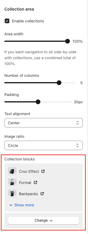
Customize the collections area
The Collection area settings only appear for the Mega menu and collections block.
Similar to the Promos area in the other block, you have many of the same design settings which give you full control over how your Collection images display.
- Area width
- Number of columns
- Padding
- Text alignment
- Image ratio
- Collection blocks (up to 12 collections)
You can select which collections appear within your Collection mega menu by adding them as collection blocks.
Information: If you do not have an image assigned to a particular collection, the menu will display the first existing product image in that collection as a fallback.
Set up the navigation drawer
The headline feature of the navigation drawer from Venue 10 onwards is that is will display the promo images and collection images that you have assigned to your desktop mega menus. You can rest assured that any content you have set up on your desktop store will be kept intact in the mobile/navigation drawer.
In order to keep this article concise and focused we have written a separate article about the Venue 10 onwards navigation drawer. It is linked at the bottom of this article.