Venue - Header - Customize your navigation drawer
This article is for merchants using Venue version 10.0 onwards. A common weak point in Shopify stores is the mobile menu/navigation drawer. Mega menu images are often not shown in mobile view.
Venue 10 addresses this by providing a mobile menu/navigation drawer that is just as content rich as the desktop version with the addition of thoughtful mobile specific features:
Key features
- Display promo images - the same as desktop mega menu
- Display collection images - the same as desktop mega menu
- Choose carousel or grid layout for images - for each individual menu
- Add an alternative main menu - some merchants prefer to use a different menu for mobile users
- Add an secondary menu for links such as 'Returns' and 'Contact us'
- Customise the 'See more' style buttons
- Display collection images in the menu page headers
- Edit the font style/size
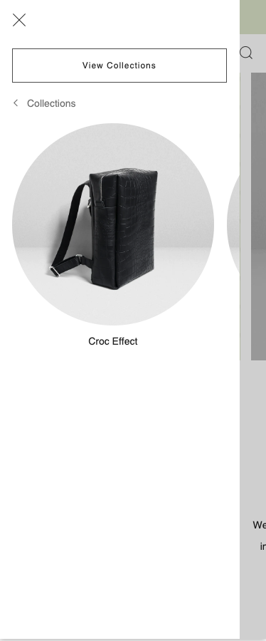
Choose your promo/collection image layout
Any images you have set up in your desktop mega menus will also display in the mobile/navigation drawer.
Within each mega menu block (mega menu article linked at the bottom of this page) are two image layout options. Both the Mega menu and promos & the Mega menus and collections blocks have the same settings. The settings are:
- Items per row - this gives you the option of displaying a grid of one image per row, or two.
- Enable carousel - this gives you the ability to display promo/collection images in a swipe carousel.
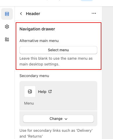
Use an alternative menu for mobile/drawer
You can find the Navigation drawer settings within your theme's Header settings by following the steps below.
- Click the Customize button in the Themes area of your Shopify admin. This will take you to the theme editor.
- On the left sidebar, click Header.
- Scroll down until you reach the Navigation drawer settings
We have introduced an Alternative menu setting, which allows you to use a different main menu than the one you are using for desktop. Some merchants prefer to offer a different menu for mobile users.
Information: Leave this blank to default to the same menu as you have chosen for your main desktop settings.
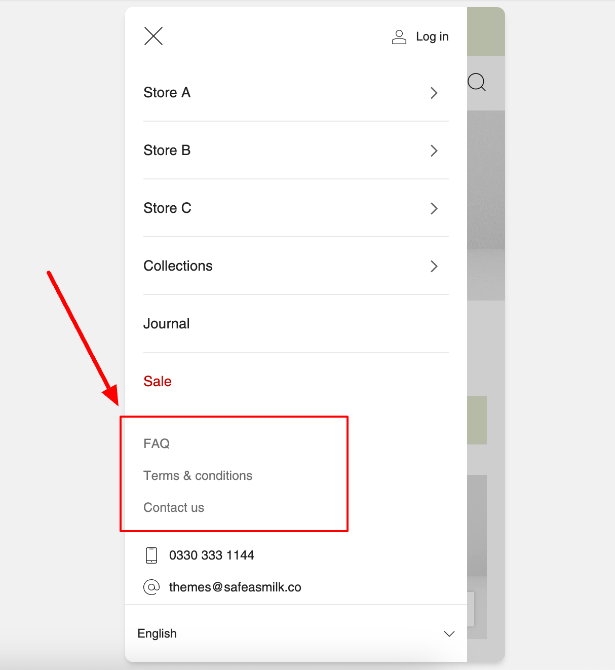
Add an secondary menu for utility links
Some mobile users need a quick way to find certain pages like 'Contact us' and 'Returns' without having to close the navigation drawer and scroll all the way to the footer of your store. This feature gives you a quick way to add secondary menu on the first page of your navigation drawer.
Customise the 'See more' style buttons
We have added this functionality because unlike desktop navigation, the sub menus in the drawer are hidden from view until you tap on a parent link/word to view them.
This causes a conflict in that you may also want your 'Informal' parent link to navigate to that particular collection/page in your store too. In a navigation drawer the 'Informal' link can't function as BOTH a link to a collection/page AND a trigger to open the Informal sub menu. To solve this problem we have automatically created a button for your convenience and to improve the shopping experience for your visitors.
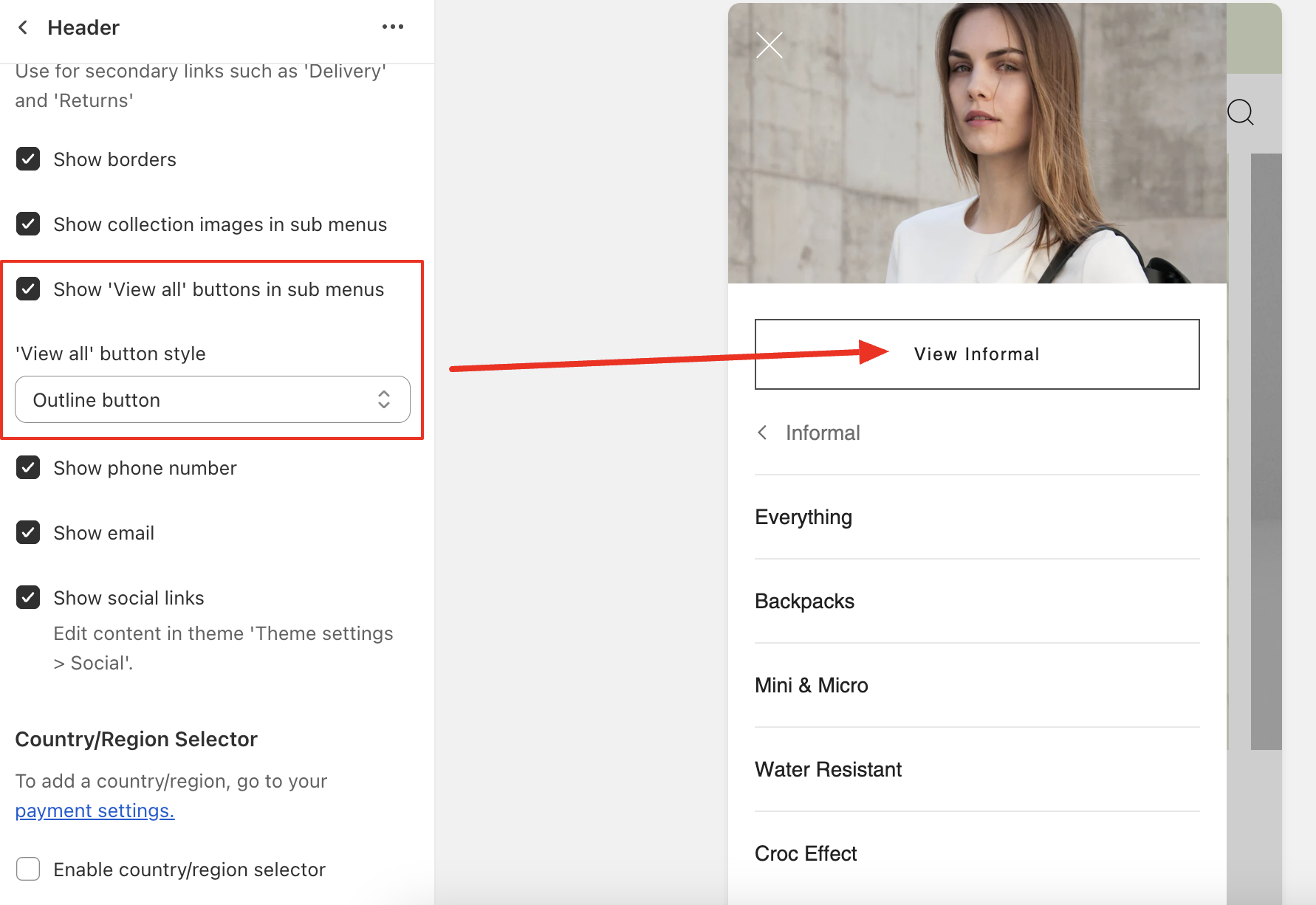
The button label will automatically populate using the text of the navigation link and append the word 'View' in front of it. So if 'Informal' is the parent link, the button label will read 'View Informal'
You can customize the text shown in these buttons by using translations.
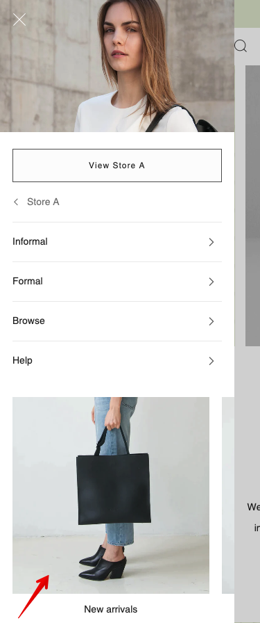
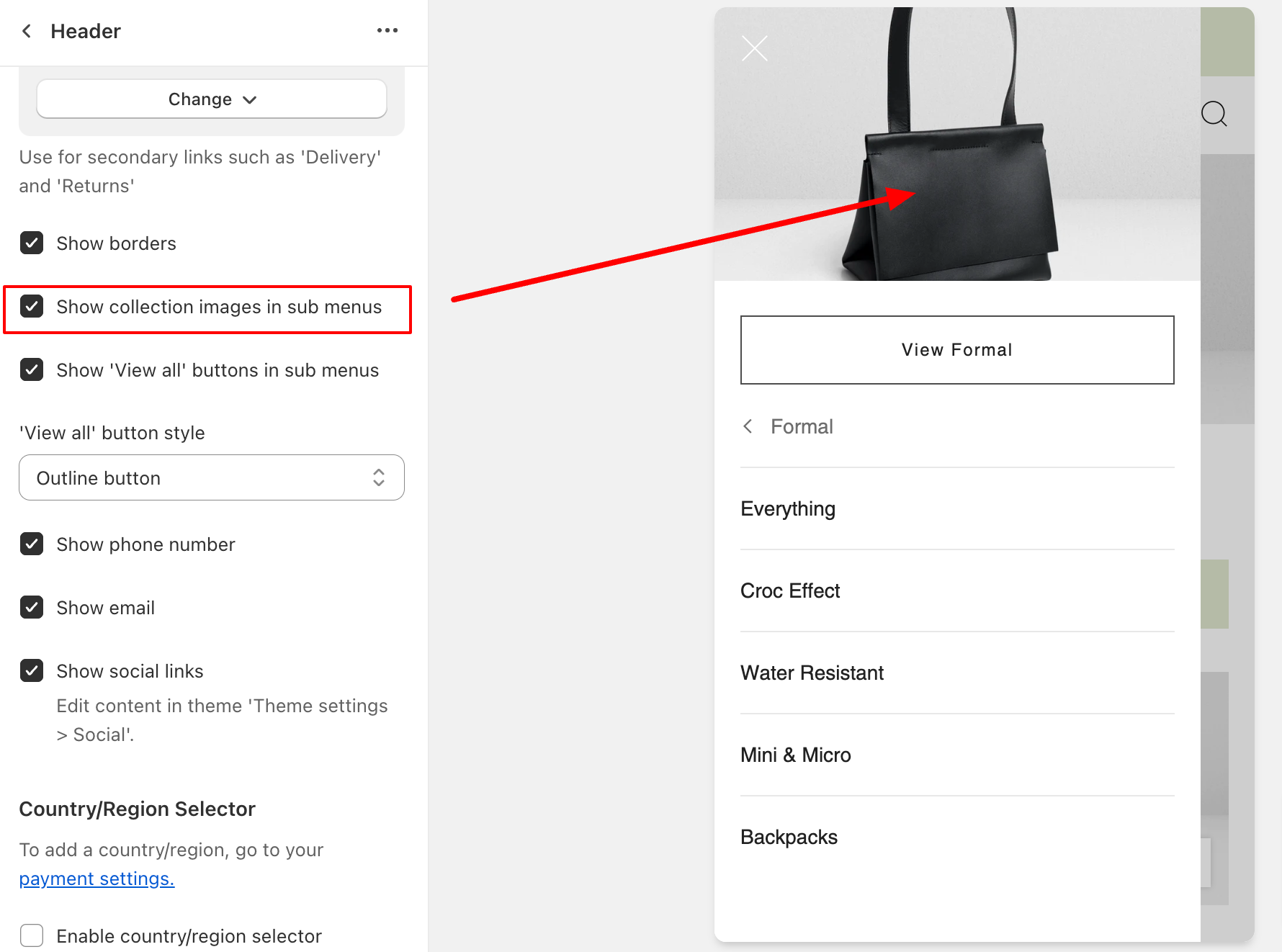
Display collection images in the menu headers
You can now display the collection images in the sub menu pages of your drawer. Enable the Show collection images in sub menus setting to do this. This provides a richer content look to your sub menus.
Information: If you do not have an image assigned to a particular collection, the header will display the first existing product image in that collection as a fallback.
Edit the font style/size of your navigation drawer
If you wish you may also change the style and size of the fonts used in your mobile menu/navigation drawer
- Click the Customize button in the Themes area of your Shopify admin. This will take you to the theme editor.
- On the left sidebar, click Theme settings icon - represented by a cog.
- Click on the Typography heading
- Inside typography scroll down until you reach the Navigation drawer settings
-
Save and check your work

